Loading…
Brand Standards · Version 1.0
The Power A Family Sun
Our complete visual identity — logo, color, type, and ready-made assets. Please use these official files rather than recreating anything. For press or partnerships, email powerafamily@gmail.com.
01 · Logo
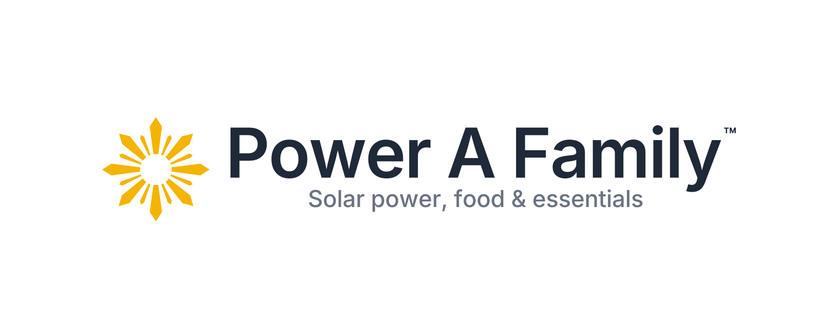
The logo system
One frozen master, eight ready files. Pick the version with the most contrast for its background; the tagline appears only in marketing lockups, never in the logo itself.
Standalone sun with ™ — variations
Use only when the sun appears alone and large — hero graphics, merch, signage. Keep the clean no-™ icon above for favicons, avatars, and pins.
02 · Construction
Clear space & minimum size
Give the sun room, and never shrink it past legibility.
03 · Misuse
What not to do
Each of these breaks the mark.
04 · Color
Color palette
Gold leads. Teal is the platform. Coral signals urgency. Charcoal and warm white do the quiet work.
05 · Type
Typography system
Two typefaces, used with intent. (The logo wordmark is frozen artwork — Inter SemiBold, outlined — and is never reset in a live font.)
Montserrat
Headings
Headings, section titles, marketing headlines, presentation titles, and major UI headings. Weights 700 / 800.
ABCDEFGHIJKLM
abcdefghijklm 0123456789
abcdefghijklm 0123456789
Inter
Body
Body text, UI, forms, labels, navigation, cards, and long-form content. Weights 400–600.
ABCDEFGHIJKLM
abcdefghijklm 0123456789
abcdefghijklm 0123456789
06 · Social
Social media
Cover art sized per platform, profile tiles for avatars, and editable post templates. Use the teal sun tile as every profile picture.


Post templates — swap the photo & headline


07 · Web
Website & app icons
Favicons, PWA icons, and header/footer logos — already wired into the live site.
App icon
 16px
16px 32px
32px 48px
48px PWA 192
 PWA 512
 Maskable
On white
Transparent PNG
08 · Usage
Document & placement rules
The short version — keep the sun clean, high-contrast, and consistent.
Do
- Use the reversed logo on teal, dark, or photographic backgrounds.
- Lead documents and letterhead with the horizontal logo, top-left or centered.
- Set headings in Montserrat and body copy in Inter.
- Keep clear space and respect the minimum sizes.
Don’t
- Don’t recolor, stretch, rotate, or add effects to the logo.
- Don’t set the wordmark in a different font — it’s frozen artwork.
- Don’t use off-palette colors or low-contrast pairings.
- Don’t place the gold logo on busy photos — use the reversed white.
Trademark
The Power A Family sun is an unregistered trademark (™) of Power A Family. Keep the ™ on the standalone logo and don’t use the mark in a way that implies endorsement without permission. Questions: powerafamily@gmail.com.
↓ Download the full brand kit (.zip)